Branding, PACKAGING, CHARACTER DESIGN

Welcome to the world of Smokies, where cannabis meets creativity

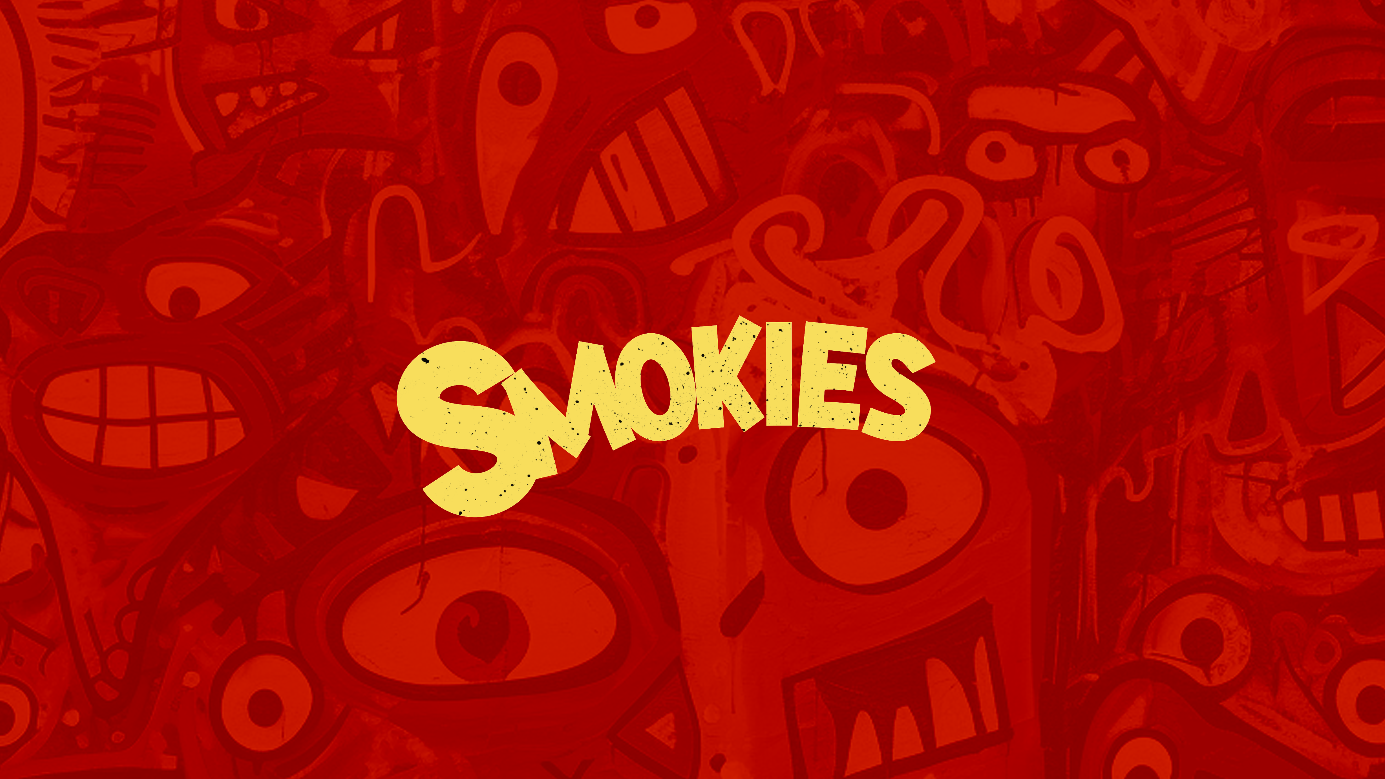
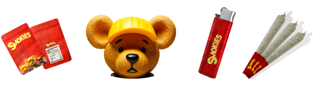
In this case study, we delve into our collaboration with Smokies, a trailblazing cannabis brand, as we brought their vision to life through captivating branding, innovative packaging design, and the creation of memorable brand characters. Join us on a journey of discovery as we explore the fusion of artistry and cannabis culture.
Central to the Smokies experience is its vibrant and dynamic brand identity. Drawing inspiration from the rich tapestry of cannabis culture, we crafted a visual language that spoke to the brand’s ethos of inclusivity and creativity. From the logo design to the color palette and typography, every element was carefully curated to evoke a sense of excitement and adventure.

Packaging design

In a market saturated with cannabis products, packaging design is a critical differentiator. For Smokies, we embarked on a journey of innovation, designing packaging that not only stood out on dispensary shelves but also exuded urban luxury. Each package was crafted to evoke a sense of sophistication and exclusivity, serving as a canvas for the brand’s narrative and enhancing the overall consumer experience.

character design

Central to the Smokies brand is its iconic bear character, a symbol of urban sophistication and adaptability. Tasked with creating a character that could change clothes and embody luxury vibes, we set out to design a bear that exuded style and personality. From its sleek silhouette to its expressive features, the Smokies bear represents the brand’s commitment to innovation and individuality.

Shoot us a message

Typically responds within 4-7 hours.